
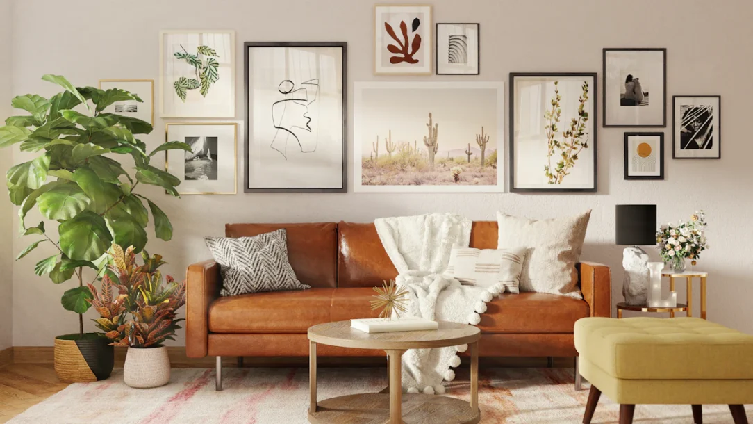
A good gallery wall should feel collected, not calculated. The frames do not need to match perfectly, every piece does not need to be the same size, and the arrangement does not have to follow a rigid grid. What matters is that the whole composition feels balanced, connected to the room, and personal enough that it could only belong in your home.
The easiest way to get there is to treat the gallery wall as one large piece of art. Choose a clear visual anchor, repeat a few colors or frame finishes, control the spacing, and let meaningful photos, art, sketches, prints, textiles, postcards, or small objects provide the personality.
Table of Contents
Start With the Wall, Not the Frames
Before collecting frames, decide what the wall needs to do in the room. A gallery above a sofa should relate to the width and placement of the sofa. A staircase arrangement should move with the angle of the stairs. A hallway gallery may need a narrow vertical rhythm instead of a wide composition.
Stand back far enough to see the wall with the surrounding furniture. Mark the approximate area the gallery can occupy, then photograph the empty wall. This immediately makes it easier to judge whether the layout should be wide, tall, symmetrical, or intentionally irregular.
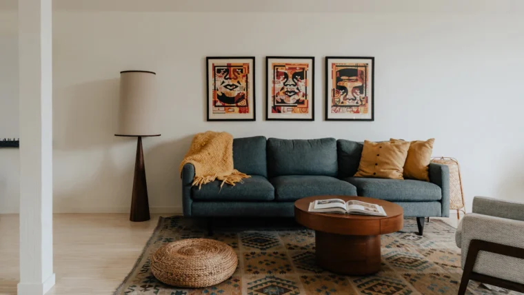
If the gallery will become the main feature in a living room, plan it as part of the entire furniture arrangement rather than a separate decorating project. The step-by-step principles in this living room decorating guide can help you balance art with the sofa, lighting, rugs, and other focal points.
Choose an Anchor Piece First
Every successful gallery wall needs at least one piece that carries more visual weight. It may be the largest frame, the darkest artwork, a colorful photograph, an antique textile, or simply the piece that means the most to you.
Place that anchor near the visual center of the arrangement, but do not feel forced to center it mathematically. In an organic layout, moving it slightly off-center often makes the composition feel more relaxed. Smaller pieces can then branch outward while still taking their cue from the anchor.
Build a Collection That Actually Feels Personal
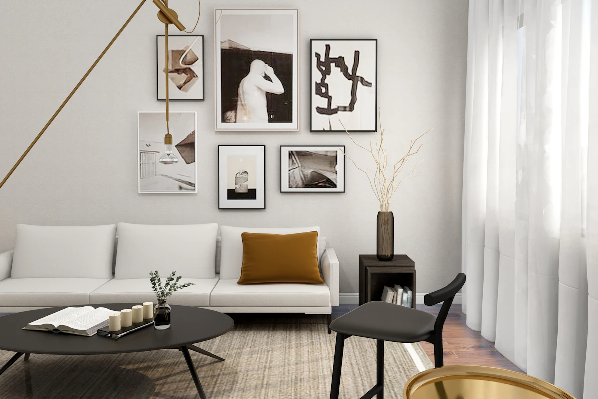
The wall becomes more interesting when every piece is not simply “wall art.” Mix real parts of your life into the collection: family photographs, travel prints, kids’ drawings, small paintings, vintage postcards, handwritten notes, maps, fabric, sketches, album artwork, or a print from a local artist.
Current 2026 design coverage is leaning strongly toward personality rather than pre-curated frame sets. House Beautiful’s recent designer guide similarly emphasizes collections that feel gathered over time instead of bought as a complete matching package.
The subjects can be different if something else connects them. You might repeat a color, a photography style, a period, a mood, or a consistent amount of white matting. The collection needs a thread, not a theme.

Create Cohesion Without Making Every Frame Match
Matching frames create a clean grid, but an organic gallery often looks richer when finishes vary. The trick is to repeat a limited family of materials instead of using every finish available.
For example, mix black, walnut, and aged brass. Or use warm wood frames with two or three painted frames that repeat a color in the artwork. When several finishes recur more than once, the variation feels intentional rather than random.
Matting can create another layer of cohesion. A collection of unrelated art suddenly feels more unified when several pieces use similar white, cream, or off-white mats. If your home’s palette already flows through several rooms, use the ideas in this whole-home color palette guide to choose frame finishes that connect with nearby furniture and trim.
Keep the Spacing Consistent
Spacing is one of the fastest ways to make a gallery wall look either polished or accidental. You do not need laboratory precision, but the gaps should feel consistent enough that the pieces read as one group.
Framebridge recommends roughly 2 to 3 inches between frames for many gallery wall arrangements. Use that as a starting point, then adjust for scale. Tiny frames may need slightly tighter gaps; large pieces can handle a little more breathing room.
The important part is rhythm. If one gap is two inches and another is seven, the eye reads the wall as disconnected unless that larger space is clearly intentional.
Plan the Overall Size Before Hanging Anything
A gallery wall can contain ten beautiful pieces and still feel wrong if the overall footprint is too small for the furniture below it. Treat the outer edges of the collection as if they form one imaginary rectangle.
Above a sofa, console, or bed, the grouping should feel connected to the furniture rather than floating far above it. The exact dimensions depend on the room, but the composition usually looks stronger when its total width has enough scale to relate to the piece beneath it.
Choose Between a Grid and an Organic Layout
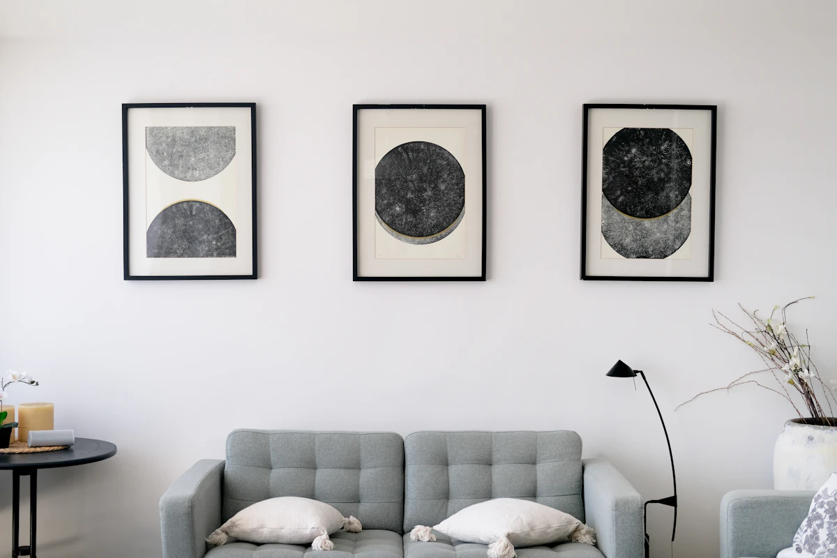
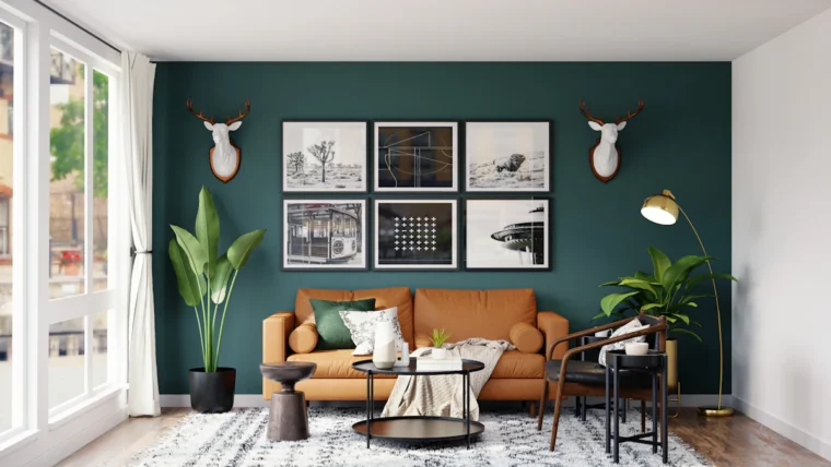
A grid is the easiest route to a quiet, architectural result. It works well with equal-size photographs, botanical prints, line drawings, or a series from one artist. Identical frames and equal spacing let the content become the focus.
An organic arrangement is better when the collection includes multiple sizes, orientations, and frame styles. It feels more collected and personal, but it still needs structure. Use one anchor piece, keep the gaps controlled, and distribute dark, colorful, or visually heavy pieces around the wall instead of clustering them on one side.
Lay the Gallery Wall Out on the Floor First
Before making holes, build the full arrangement on the floor. Start with the anchor, add the next two largest pieces, then fill the gaps with smaller frames. Step back frequently and photograph each version you like.
A phone photo is useful because it flattens the composition and makes imbalance easier to spot. If one side feels too dark, move a dark frame across the layout. If the top is visually heavy, shift a large horizontal piece lower.
Use Paper Templates for a Complicated Arrangement
For a large gallery wall, trace each frame onto kraft paper, newspaper, or inexpensive packing paper. Cut the shapes out, label them, and tape the templates to the wall with painter’s tape.
This lets you judge the real height, relationship to furniture, and outer footprint before committing. Mark the hanger location directly on each paper template so the nail or hook can be placed accurately.
Hang the Center of the Grouping at a Comfortable Viewing Height
Do not hang every frame according to its individual center. Treat the gallery as one large object and judge the center of the entire grouping. A common starting point is around eye level; current hanging guides often use roughly 57 to 60 inches from the floor to the center of the overall art grouping.
That is a starting point, not a rule. A gallery above a low sofa may need to sit lower so it relates to the furniture. A staircase wall follows a rising sight line. A home with unusually high ceilings should not automatically pull the gallery toward the ceiling and away from the people viewing it.
Use the Right Hardware for Every Frame
The visual layout only works if the physical installation is secure. Check the weight of each frame and the wall material before choosing nails, hooks, anchors, screws, or hanging systems.
The Smithsonian Museum Conservation Institute recommends sturdy, appropriately sized hardware and notes that wall studs provide maximum stability; large or heavy paintings may also need suitable wall anchors. See the Smithsonian’s painting-care and hanging guidance.
Never assume the hardware included with a frame is correct for every wall. Drywall, plaster, brick, masonry, paneling, and tile all require different approaches. When a piece is unusually heavy or valuable, use professional installation rather than improvising.
Make a Renter-Friendly Gallery Wall Without Guessing
Renters can still create a gallery wall, but “no drill” does not mean every adhesive product is safe for every paint finish or frame weight. Use only hanging products rated for the weight you are installing and follow their surface-preparation and removal instructions exactly.
For lightweight art, removable strips or hooks may be appropriate. Heavier frames may need a different plan or landlord approval. The options in these renter-friendly wall decor ideas can help you choose methods that fit the lease and wall surface.
Adapt the Layout to Hallways, Stairs and Small Walls
A gallery wall does not need a huge living room wall. Narrow spaces can actually make the collection feel more intimate. In a hallway, use a vertical column, a tight cluster, or a series of smaller pieces instead of trying to create a wide sofa-style composition.
On a staircase, let the arrangement rise with the stair angle rather than forcing a horizontal top line. Keep enough visual space around door trim, switches, railings, and corners so the wall does not feel squeezed into leftover space.
For tiny entry walls, pair the artwork with the functional strategies in these very small entryway ideas so frames do not compete with hooks, mirrors, storage, or the main walking route.
Protect Art From Harsh Light and Heat
Placement affects the artwork itself, not just the room. The Smithsonian conservation guidance recommends keeping paintings away from heat sources, direct sunlight, and unstable humidity. That matters especially for original paintings, photographs, textiles, and works on paper.
If the best gallery wall receives strong sun, consider UV-filtering glazing for valuable pieces or use reproductions there while keeping originals in a more protected location. Do not position sensitive art directly above a radiator, fireplace opening, or other strong heat source.
Common Gallery Wall Mistakes
Making the whole grouping too small. A tiny cluster can look lost above a large sofa or console. Plan the outer footprint first.
Spacing every frame differently. Organic does not mean random. Keep the gaps within a deliberate range.
Putting every large piece on one side. Distribute visual weight so the wall does not appear to lean.
Buying a complete matching set just to fill the wall. A gallery wall becomes more memorable when at least some pieces carry personal history or real visual interest.
Hanging too high. Art should relate to people and furniture, not drift toward the ceiling.
Ignoring the room’s other focal points. If the wall already contains a TV, fireplace, strong wallpaper, or architectural detail, make sure the gallery supports rather than fights it. If wallpaper is part of the plan, this peel-and-stick wallpaper guide explains where removable wallpaper works and where it tends to fail.
Frequently Asked Questions
How far apart should pictures be on a gallery wall?
About 2 to 3 inches is a useful starting point for many arrangements. Small frames may work slightly closer and larger pieces can handle more space, but keeping the gaps visually consistent matters more than following one exact number.
Should all frames in a gallery wall match?
No. Matching frames create a clean grid, but mixed frames can feel more collected and personal. Repeat two or three finishes, colors, or mat styles so the variety still feels connected.
How high should a gallery wall be hung?
Treat the whole grouping as one large artwork and place its center around a comfortable viewing height. Roughly 57 to 60 inches from the floor to the grouping center is a common starting point, but adjust for furniture, stairs, ceiling height, and the people using the room.
What should go in a personal gallery wall?
Mix artwork with things that carry meaning: family photos, travel prints, children’s art, postcards, sketches, vintage pieces, textiles, maps, or small works from local artists. The wall feels more intentional when it reflects real interests rather than one purchased set.
How do I plan a gallery wall without making lots of holes?
Arrange the frames on the floor first, photograph the layout, then trace the frames onto paper and tape those templates to the wall. Mark each hanger location on the template before installing hardware.
Can I build a gallery wall in a rental?
Yes, especially with lightweight pieces and properly rated removable hanging systems. Follow the hanging-product instructions and your lease, and do not assume an adhesive method is safe for every paint finish or frame weight.
Let the Gallery Wall Grow With You
The best gallery wall does not need to look finished forever. Leave a little room at the edges so a future photograph, drawing, print, or small painting can join the collection without forcing you to rebuild the whole arrangement.
Start with a clear anchor, control the spacing, distribute visual weight, and repeat just enough frame color or material to hold everything together. Then let the actual art and memories provide the personality. When the wall feels balanced from across the room and interesting up close, it is doing exactly what a gallery wall should do.


Share Your Thoughts