
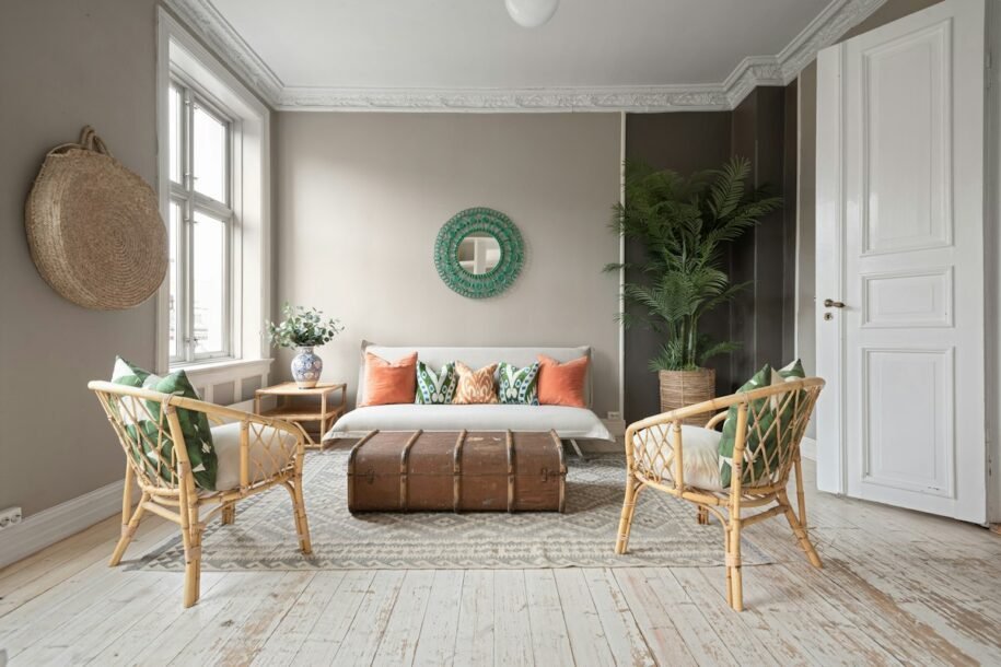
When you can see more than one room from a single spot, color choices affect the whole home—not just the room you are painting. A living room may look beautiful on its own, but if its wall color clashes with the hallway or the kitchen next door, the house can feel visually choppy. Learning how to choose colors that flow from room to room helps create a connected look while still allowing each space to have its own personality.
The secret is not painting every wall the same color. It is building a considered palette, repeating a few visual cues, and paying attention to natural light, fixed finishes, and how rooms connect. Use the following steps to create a home that feels cohesive rather than overly matched.
1. Start with the Finishes You Cannot Easily Change
Before choosing paint, look at the elements that will stay in place: flooring, kitchen cabinets, countertops, tile, brick, stone, large rugs, and major furniture. These finishes already contain colors and undertones, even when they appear neutral. A beige tile may lean pink or yellow, while a gray floor may have blue, green, or violet notes.
Choose wall colors that work with those existing features instead of trying to make every finish match exactly. If your wood floors are warm and golden, a soft warm white or muted green may feel more natural than a stark blue-white. If the home has cool gray stone, a balanced neutral with a compatible undertone may connect it more easily to adjacent rooms.
Take photos of your finishes and place paint chips beside them in the actual room. This gives you a more useful starting point than selecting colors from a screen alone.
2. Build a Whole-Home Palette Before Choosing Individual Rooms
Think of the home as one palette with several supporting colors rather than a collection of unrelated rooms. A simple approach is to choose:
- One main neutral: A warm white, soft beige, greige, or another adaptable color for the largest connecting areas.
- Two or three supporting colors: For example, muted sage, dusty blue, clay, or a deeper taupe.
- One or two accent colors: Stronger hues that appear in art, cushions, lamps, or a carefully chosen feature wall.
You do not need to use every color in every room. Instead, let the palette guide your choices. The living room might use the main neutral with sage accents; the bedroom might use the same neutral with a softer blue; the dining area might bring in a little clay or rust. The rooms feel related because their colors share a visual language.
Paint company guides such as Sherwin-Williams’ color selection advice also recommend coordinating related shades and considering existing furnishings and finishes when building a room-to-room palette.
3. Choose a Base Neutral That Works in Several Rooms
A dependable neutral can connect hallways, living rooms, dining rooms, and other spaces that open into one another. It does not have to be plain white. Cream, oatmeal, light taupe, greige, and soft stone can all serve as a base, provided the undertone suits your flooring and light.
Use the base neutral where you want continuity: a hallway, an open living-and-dining area, or a transition wall that can be seen from several rooms. Then bring in more distinctive colors where you want a change of mood. Repeating one neutral on trim and interior doors can also help separate wall colors feel connected.
Remember that the same paint can look different from room to room because of light, surrounding colors, and room orientation. A neutral that looks creamy in a sunny living room may appear grayer in a dim hallway. Test it in both locations before committing to a large paint order.
4. Repeat Colors in Small, Deliberate Ways
Color flow does not depend only on wall paint. Repeating a color in different rooms creates a connection without making every space look identical. If you use sage green in the living room, repeat a small amount in a bedroom throw, an entryway print, or a plant pot. If navy appears in dining-room art, echo it in a hallway runner or a few cushions elsewhere.
Repeat colors through objects that are easy to change—textiles, artwork, lampshades, ceramics, books, and rugs. This gives you flexibility if your taste changes or if one color looks stronger under different lighting. The goal is a recognizable thread, not a matching set.
A useful rule is to repeat a color at least twice in a space when you want it to feel intentional. It could appear in a small accessory and a larger piece of art, for example. You can also repeat materials, such as oak, black metal, brass, or natural linen, to reinforce the connection between colors.
5. Plan Open-Concept Spaces as One Connected Zone
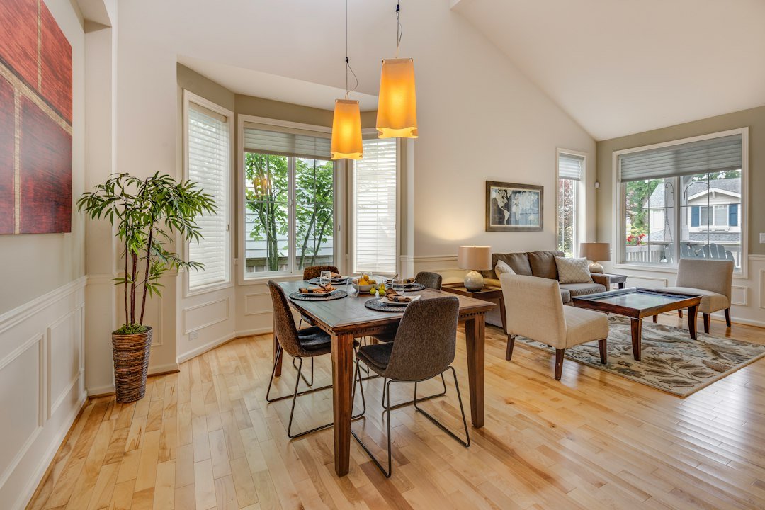
In an open-plan kitchen, dining room, and living room, colors sit side by side without a full wall or doorway to separate them. Start with a dominant color for the largest surfaces, then add variation through cabinetry, upholstery, a rug, or one secondary wall color. Too many competing wall colors can make the layout feel broken into patches.
If you want a different color in the dining area, keep it related to the living room color—perhaps a deeper shade from the same family, or a muted accent that already appears in the furnishings. Changes in paint should feel like a gentle shift, not an abrupt stop. Repeat the accent in a nearby object so the transition looks planned.
In a small open-plan home, a consistent wall color can make the overall area feel more spacious. Use texture, lighting, furniture placement, and accessories to define zones rather than relying on a separate bold paint color for every function.
6. Treat Hallways and Entryways as Visual Bridges
Hallways often connect rooms with different functions, so they are useful places to unify a palette. A hallway painted in the main neutral can make a deeper bedroom color or a richer living-room accent feel connected rather than isolated. The entryway is also the first color combination visitors see, so let it introduce the tones that appear elsewhere in the home.
If you prefer a colorful hallway, borrow a shade from a nearby room and soften it slightly. You could also keep the walls neutral and use a runner, framed art, or a painted console to carry an accent color through the space. In narrow or dim hallways, test colors carefully because low light can make mid-tone shades feel heavier than expected.
7. Keep Undertones Compatible, Even When the Colors Differ
Undertones are the subtle warm or cool notes underneath a color. Creams may lean yellow or pink; grays may lean blue, green, or violet; whites can look crisp, creamy, or slightly rosy. When two neighboring colors have undertones that fight each other, the transition may feel uncomfortable even if each color looks attractive by itself.
You do not have to use only warm or only cool colors throughout the house. A balanced palette can mix both, but give them a reason to belong together. For instance, a muted blue can work with warm wood and creamy white when the blue is softened and the same tones appear in the room’s textiles or artwork.
Compare paint chips side by side instead of judging each one separately. Sherwin-Williams explains how comparing similar paint samples can reveal undertones that are difficult to spot on their own in its guide to understanding paint undertones.
8. Check How Light Changes Each Color
Light can make one paint color appear noticeably different from one room to the next. North-facing rooms generally receive cooler, less direct light, while south-facing rooms tend to receive warmer, stronger daylight. East-facing rooms can look brighter and warmer earlier in the day; west-facing rooms may become warmer later in the afternoon. Trees, neighboring buildings, window treatments, and bulb color also affect what you see.
Test a sample on more than one wall and observe it in the morning, afternoon, and evening. Look at it with the lights on as well as off. If a hallway has little natural light, check the color under the actual bulbs you plan to use rather than assuming it will match a sunny room.
Do not expect a paint color to look identical in every room. Aim for a compatible appearance: the colors should feel related even when light changes how light, dark, warm, or cool they look. For more guidance, see Sherwin-Williams’ room-orientation color guide.
9. Give Each Room Its Own Personality Within the Same Palette
A cohesive home does not have to feel repetitive. Choose colors according to how you want each room to feel, then connect them through undertones, neutrals, or repeated accents.
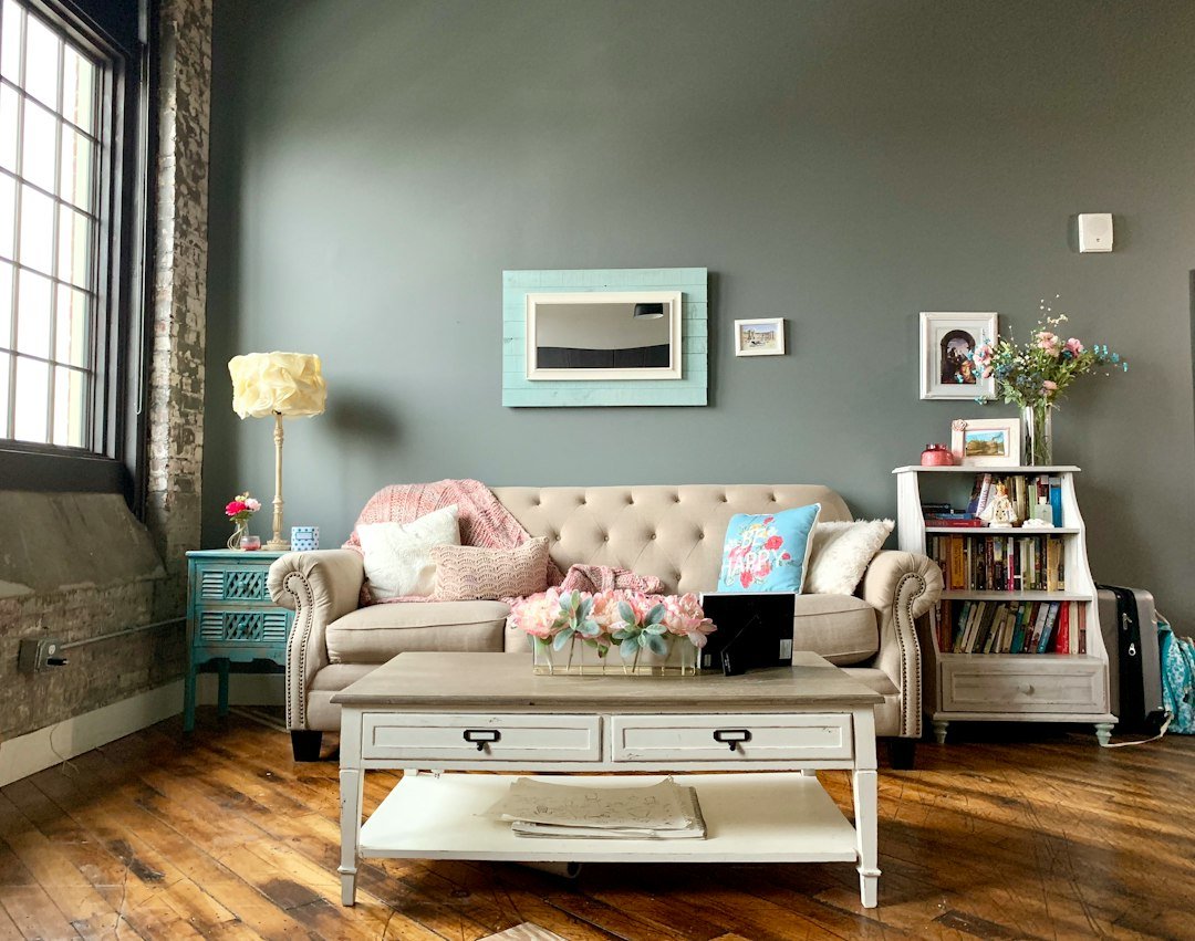
- Living room: Warm white, soft greige, or muted green can create a welcoming backdrop for layered textures and artwork.
- Kitchen and dining area: Use the same base neutral, then bring in a coordinated cabinet, island, or dining-chair color.
- Bedroom: Softer blue, sage, muted mauve, or a deeper neutral can make the room feel more restful while still relating to the rest of the home.
- Bathroom: A pale stone, soft green, or warm white can connect to the bedroom or hallway without requiring the exact same wall color.
- Home office: Borrow a supporting shade from the main palette, then use art and accessories for personality.
If you want a bedroom that feels layered rather than flat, our guide to cozy bedroom ideas offers more ways to use textiles, materials, lighting, and grounded color together.
10. Use Trim, Doors, and Ceilings to Create Continuity
Trim and interior doors are small details that can make a whole-home palette feel intentional. Using one trim color across connected rooms creates a repeated visual line, even when wall colors change. A warm white often pairs naturally with warm neutrals, while a cleaner white may suit a more contemporary palette—but the right choice depends on the walls, flooring, and fixed finishes.
Ceilings do not always need to be bright white. A soft white that shares the wall color’s undertone can feel calmer, especially in rooms where a stark ceiling would look disconnected. In some spaces, painting trim and walls the same color can make architectural details feel quieter and more seamless.
Keep the sheen and finish in mind, too. A satin or semi-gloss trim can reflect light differently from a matte wall, so even colors that appear identical on a sample may look distinct once applied.
11. Use Accent Colors with Intention
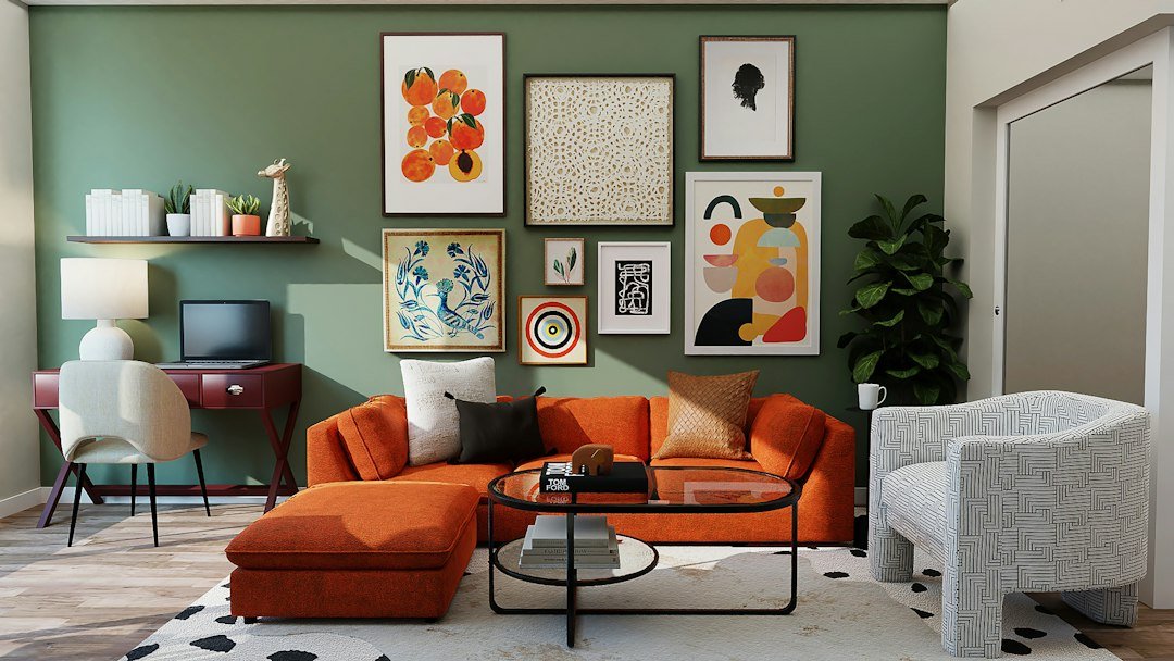
Bold colors can absolutely belong in a cohesive home. The trick is to decide where the bold color should appear and what will connect it to surrounding rooms. If you love terracotta, for example, use it in a dining-room feature, then echo it in a small piece of art or a cushion nearby. If deep green is the statement color in one room, a lighter sage or a green plant can carry the idea into an adjoining space.
Accent walls work best when the color relates to the room’s architecture and furnishings rather than appearing as an isolated rectangle. Our accent wall guide explains how to choose a wall and color that support the rest of the room.
Use stronger shades where you want emphasis, and keep the surrounding colors quieter. If every room has a different high-contrast feature wall, the eye may not know where to rest. A few well-placed accents usually create a more polished flow than a series of competing statements.
12. Test the Whole Palette Before You Paint
Do not approve a color based on a tiny chip or a digital preview alone. Get sample pots or large peel-and-stick samples, then view each candidate beside the actual floor, cabinetry, and upholstery. If possible, place samples in two connected rooms at the same time so you can judge the transition between them.
Use this practical checklist before buying paint:
- Write down the main neutral and two or three supporting colors.
- Check every color beside permanent finishes and major furniture.
- View the samples in natural and artificial light at different times.
- Look at adjacent rooms from the doorway, hall, and main sightlines.
- Confirm the trim and ceiling color works with the wall palette.
- Keep the exact paint names and finish notes in one place for future touch-ups.
If the palette feels disconnected, change one variable at a time. Often the problem is not the whole scheme but a neutral with the wrong undertone, an accent that is too saturated, or a transition wall that needs a softer shade.
Common Mistakes That Interrupt Color Flow
- Choosing every room in isolation: Always compare colors with the rooms visible next door.
- Using too many unrelated neutrals: Several whites, grays, and beiges can clash when their undertones differ. Choose them deliberately.
- Ignoring fixed finishes: Paint cannot make a floor or countertop disappear; work with the colors already present.
- Trusting online images too much: Screens, photo editing, and lighting can distort paint colors. Sample them at home.
- Making every room identical: Flow comes from relationships and repetition, not from removing all variety.
- Skipping the hallway: Transitional spaces can make a dramatic color change feel abrupt if they are not considered in the plan.
For seasonal inspiration, you can also explore our room-by-room fall decor guide, which shows how earthy tones and repeated materials can connect different areas of a home.
Frequently Asked Questions
Should every room in a house be the same color?
No. A consistent palette usually works better than one identical wall color everywhere. Use a main neutral in connecting spaces, then add related supporting colors to give bedrooms, dining rooms, and other rooms their own character.
How many paint colors should I use throughout my home?
There is no fixed number, but a manageable starting point is one main neutral, two or three supporting colors, and one or two accents. You can adjust the palette for your home’s size, layout, and style while keeping the colors compatible.
What color helps connect rooms with different styles?
A versatile neutral—such as a warm white, beige, greige, or soft taupe—can bridge different furniture styles. Choose its undertone based on the flooring, cabinetry, and light, then repeat one or two accent colors to create a thread between rooms.
Should hallways be the same color as adjoining rooms?
They do not have to be, but hallways often work well in the home’s main neutral because they connect different spaces. If you prefer a stronger hallway color, choose a shade that relates to the rooms it links and test it in the hallway’s lighting.
How do I coordinate warm and cool paint colors?
Compare undertones and connect the colors through a shared neutral, flooring, wood tone, textiles, or artwork. Warm and cool colors can work together when their intensity and surrounding materials feel balanced; they do not need to belong to exactly the same color family.
Why does the same paint color look different in different rooms?
Natural light, window direction, bulb temperature, shadows, and nearby colors all influence how paint appears. Test the shade in each room and judge whether it feels harmonious with the palette, rather than expecting it to look exactly the same everywhere.
What is the easiest way to make an open-plan home feel cohesive?
Start with one main wall color across the connected area, then define zones with furniture, rugs, lighting, and a small number of related accent colors. If you use a second wall color, choose one that transitions smoothly from the main shade.
Final Thoughts
Choosing colors that flow from room to room is about creating relationships between spaces, not following a rigid decorating rule. Start with the finishes you already have, build a small whole-home palette, repeat colors in thoughtful ways, and test every important shade in its actual lighting. With a little planning, each room can feel individual while the entire home feels connected.


Share Your Thoughts