
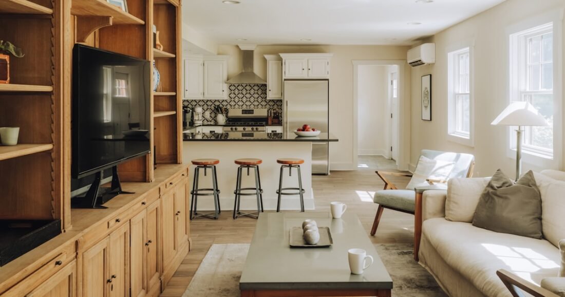
A whole-home color palette does not mean painting every room the same color. It means choosing a small family of colors and finishes that relate to one another so moving from the living room to the kitchen, hallway, bedroom, and bathroom feels intentional rather than accidental.
The easiest way to build that kind of flow is to start with the surfaces you cannot easily replace, identify their undertones, then choose a dependable base color and a limited set of supporting hues. This approach works in open-plan homes, small apartments, traditional houses with separate rooms, and homes where you are decorating gradually rather than all at once.
Table of Contents
Why a Whole-Home Color Palette Helps
A connected palette makes decorating decisions faster because every new choice has context. Instead of asking, “Do I like this pillow?” you can ask, “Does this color belong in the palette I already chose?” That simple filter reduces impulse purchases and makes mixed furniture, older finishes, and new pieces feel more cohesive.
It also matters most in places where several rooms are visible at once. An open living room, kitchen, and dining area may contain different furniture and functions, but repeating a wall tone, wood finish, metal, or accent color gives the eye a visual thread to follow.
Start With Fixed Finishes
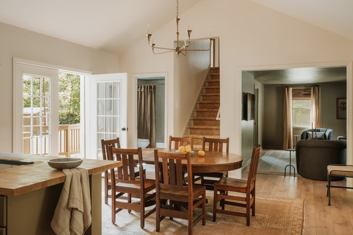
Walk through the house and list the colors you are unlikely to replace soon: flooring, kitchen cabinets, countertops, backsplash, fireplace stone, bathroom tile, large wood furniture, and broad areas of carpet. These materials should carry more weight than small decorative items because they occupy more visual space and cost more to change.
Then identify the undertone of those finishes. Warm oak, cream stone, beige tile, and brass point toward a warmer foundation. Blue-gray cabinetry, cool marble, chrome, and charcoal may support a cooler direction. If your fixed finishes are mixed, a balanced greige, soft off-white, or muted taupe can often bridge them more successfully than a strongly yellow beige or icy gray.
If undertones feel confusing, our guide to warm neutrals vs. cool neutrals explains how to compare them under real lighting.
Choose a Main Neutral or Background Color
Your main neutral does not have to appear in every room, but it should work in the highest-traffic spaces and the areas you see most often. In many homes, that means the entry, hallway, living area, kitchen, and connecting walls.
Good candidates are usually colors that sit comfortably beside several existing materials. Warm white, soft cream, pale greige, muted mushroom, light taupe, or a restrained gray can all serve as a background. The exact color matters less than its compatibility with the home.
Do not choose the base color from a digital swatch alone. Sherwin-Williams notes that both undertones and light direction can change how a neutral appears, and its guidance on room orientation is a helpful reference when evaluating samples.
Build a Small Supporting Palette
Once the background color is established, add two to four supporting colors that can travel through the home in different amounts. These might include a deeper neutral, a muted natural color, a wood tone, and a small accent.
| Palette role | Example | Where it can repeat |
|---|---|---|
| Main background | Warm off-white | Hallway, living room, kitchen walls |
| Supporting neutral | Taupe or mushroom | Rugs, upholstery, bedroom walls |
| Natural color | Muted olive | Pillows, art, cabinetry, textiles |
| Material tone | Medium walnut | Furniture, frames, shelves |
| Small accent | Terracotta or rust | Ceramics, throws, artwork |
You do not need to distribute every color equally. One room may use mostly warm neutrals with olive accents, while a bedroom uses the same neutral base with a small amount of rust. Repetition creates connection without making the rooms identical.
Use Sightlines to Plan Color Transitions
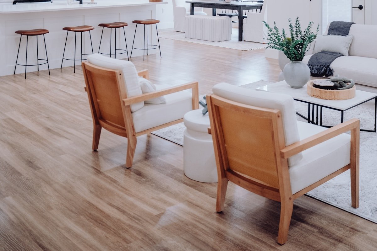
Stand in the entry, the center of the living room, and the main hallway. Note which rooms are visible at the same time. These sightlines matter more than whether two colors look attractive on separate mood boards.
In an open-plan layout, major wall colors should usually relate closely because there may be no natural architectural break. In a bedroom with a door, you have more freedom to use a deeper or more personal color because the room can visually separate from the main palette.
When a hallway connects several rooms, treat it as a transition zone. A stable neutral there can calm stronger colors in adjoining rooms. The same idea is useful in compact homes; our apartment living room guide explains how visual continuity helps small spaces feel less fragmented.
Test Color in Real Light Before Committing
A whole-home palette can fail if the colors were chosen in isolation. Test large samples in each room where you plan to use them. A warm greige that is quiet in a sunny living room might become muddy in a dark hallway. A soft blue that is elegant in a south-facing bedroom may look much cooler in a north-facing office.
- View the sample beside flooring and trim.
- Check morning, afternoon, and evening light.
- Turn on the lamps and overhead fixtures you actually use.
- Compare the color from the adjoining room.
- Look at the darkest corner as well as the brightest wall.
Sherwin-Williams’ undertone guide recommends comparing colors rather than judging a light neutral alone. That is especially valuable when coordinating several rooms.
Room-by-Room Examples
Here is one practical example for a home with medium oak flooring and warm white kitchen cabinets:
- Entry and hallway: soft warm white walls with black and walnut accents.
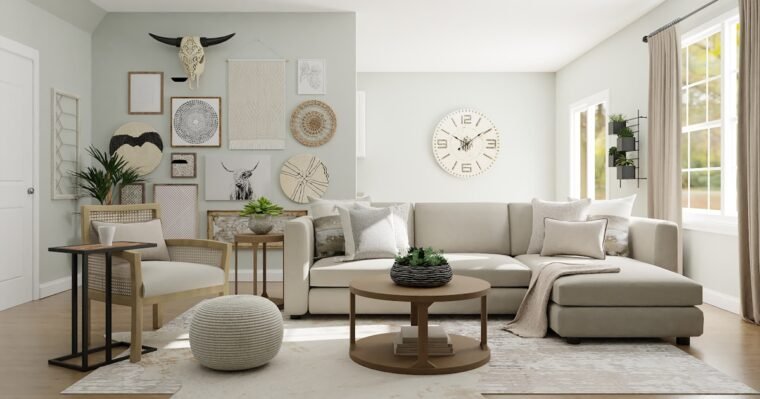
- Living room: the same warm white, oatmeal sofa, olive chair, walnut coffee table, restrained rust in artwork.
- Kitchen: existing warm white cabinets, pale stone, walnut stools, muted green ceramics.
- Bedroom: slightly deeper mushroom walls, ivory bedding, walnut and muted rust.
- Bathroom: warm off-white walls, existing beige tile, black or brushed metal accents.
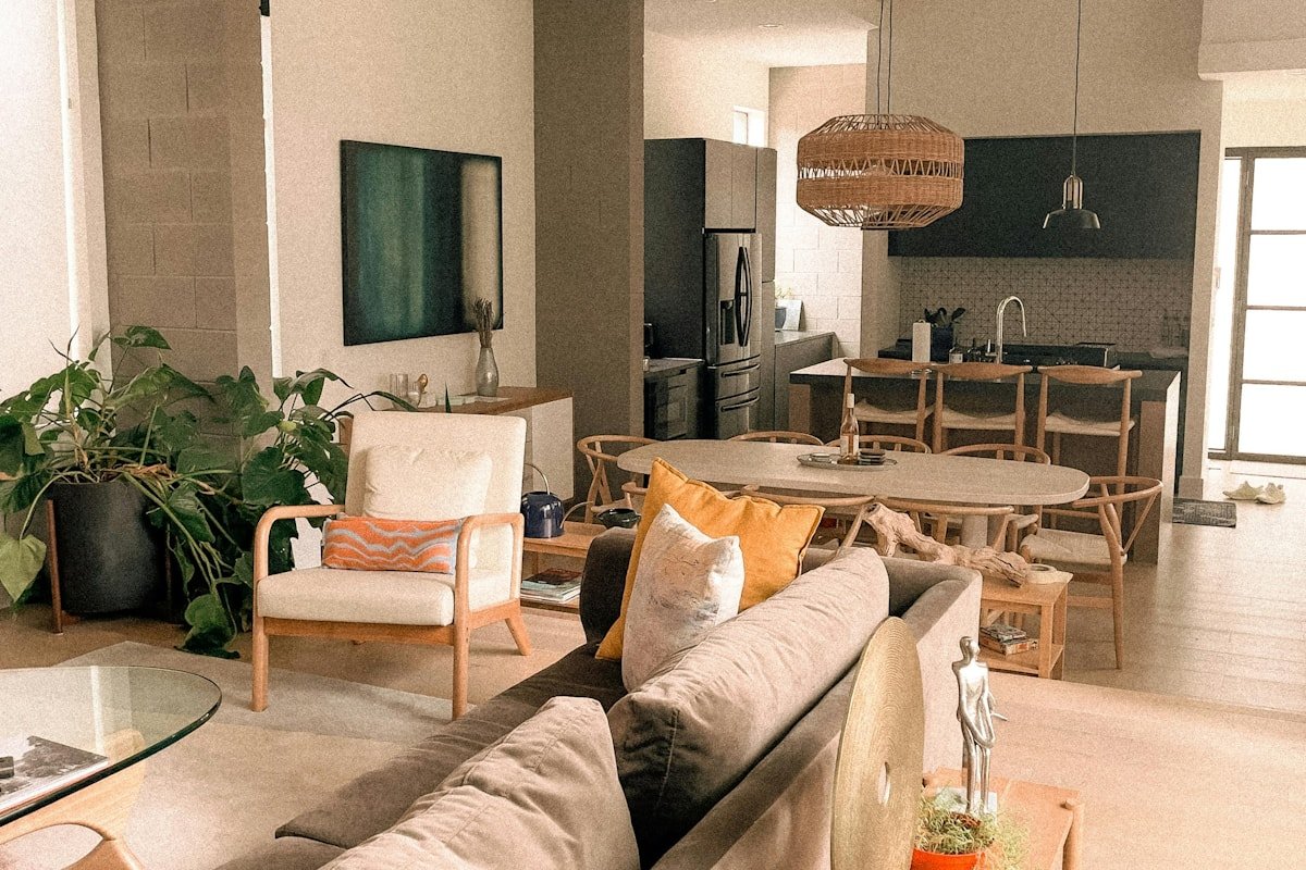
A cooler home might use a soft greige main color, charcoal or slate as the deeper neutral, pale oak as the repeated material, and muted blue-green as the natural accent. The method stays the same even when the colors change.
Common Whole-Home Palette Mistakes
- Choosing paint before checking fixed finishes: the wall color should work with the floor, stone, cabinetry, and large furniture.
- Using a different “neutral” in every room: multiple beige, gray, and white undertones can clash more than deliberate color.
- Making open rooms unrelated: visible spaces need at least one shared color, material, or finish.
- Trying to make every room identical: cohesion is repetition, not duplication.
- Forgetting artificial lighting: bulb color can change how connected paint colors appear after sunset.
- Following a trend instead of the house: permanent finishes should have more influence than this year’s popular shade.
If you want current inspiration without letting trends run the project, see our home decor trends for 2026 and use only the colors or materials that already make sense with your home.
Frequently Asked Questions
How many colors should be in a whole-home color palette?
A practical palette often includes one main neutral, two or three supporting colors, and a few repeated material tones such as wood or metal. You can use different proportions in each room.
Does every room need to be painted the same color?
No. Use related colors and repeat a few finishes or accents. Separate rooms can be darker, softer, or more colorful while still belonging to the same overall palette.
Should I choose flooring or paint color first?
If the flooring is staying, let it influence the paint. Flooring covers a large area and is more expensive to change, so its undertone should guide flexible wall colors.
Can warm and cool colors be used in the same house?
Yes. Keep one temperature dominant in connected spaces and use the other deliberately as contrast. A recurring neutral, wood tone, trim color, or metal finish can tie them together.
What is the best neutral for an open-plan home?
There is no universal best neutral. Choose one that works with the flooring, kitchen finishes, daylight, and large furniture visible across the open space, then test it on multiple walls.
How do I make bold rooms flow with neutral rooms?
Repeat one or two elements from the main palette inside the bold room, such as the same trim, wood tone, rug color, or metal finish. A doorway gives you more freedom to change wall color.
Build the Palette Before You Buy More Decor
A useful whole-home color palette is less about finding a perfect set of trendy colors and more about creating a dependable system. Start with the finishes that are staying, choose a compatible background neutral, add a small group of supporting colors, and test every important choice in the home’s real light and sightlines.
Once that framework is clear, shopping becomes easier because each new rug, curtain, chair, or piece of art has a reason to belong. You can still change the mood from room to room; the palette simply keeps the house speaking the same visual language. If your home includes a detached poolside retreat, our pool house design guide shows how repeating finishes can connect an outdoor lounge with the main house.


Share Your Thoughts