
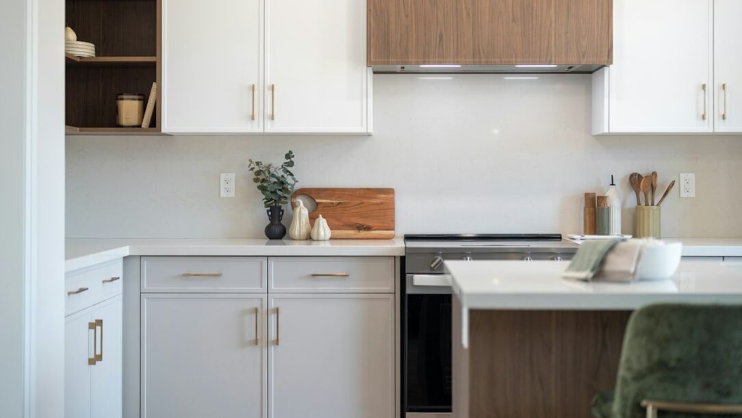
A rental kitchen can be perfectly functional and still feel unfinished. The backsplash is often the biggest clue: blank painted drywall, dated beige tile, or a glossy surface that does not relate to the cabinets or counters. The best renter friendly kitchen backsplash ideas change that visual center of the room without pretending every peel-and-stick product is completely risk-free.
The goal is a backsplash that looks intentional enough to pass for part of the kitchen, yet can be removed or reversed with less disruption than traditional tile. That means choosing the right material for the existing surface, matching the scale of the pattern to the room, planning seams carefully, and testing the adhesive before covering an entire wall. If the kitchen is already visually busy, it also helps to simplify the surrounding surfaces; our guide to making a kitchen feel larger with decor is a useful companion when you are deciding how much pattern the room can handle.
Table of Contents
Before You Buy: Know the Wall You Are Covering
Peel-and-stick is not one universal material. Some products behave more like repositionable wall film; others use a stronger adhesive because they are designed to survive heat, grease, and daily cleaning. Read the exact installation and removal instructions for the product you plan to use.
WallPops, for example, specifies a smooth, dry, clean, firm surface, recommends allowing newly painted walls to cure before installation, and advises a test patch first. Its tile instructions also warn that stronger backsplash adhesive can potentially lift paint during removal. See the WallPops installation guide for the current product-specific directions. If your lease restricts adhesive wall treatments, get written permission before installing anything.
1. Classic White Subway Tile With Better Proportions
White subway tile is the safest choice when the cabinets, counters, and flooring already compete for attention. The trick is choosing a version that does not look like a printed sticker sheet. Look for believable grout spacing, subtle surface variation, and a satin or soft-gloss finish rather than plastic-looking shine.
A slightly elongated subway shape can feel more current than a tiny brick pattern. If the cabinets are warm white, cream, oak, or greige, avoid a blue-white backsplash that makes everything around it look yellow. Matching undertones matters more than matching exact colors.
2. Sage or Olive Zellige-Look Tile
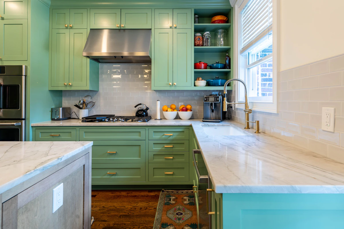
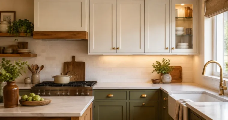
Muted sage, olive, or gray-green backsplashes work especially well with white cabinets, natural oak, black hardware, and warm brass. A zellige-inspired surface has slight tonal variation, which helps a removable product feel less flat and mass-produced.
Keep the rest of the kitchen quieter when you use color on the backsplash. If the countertop already has strong veining or speckle, choose a nearly solid green rather than a tile with several shades. For more ways to coordinate a rented kitchen without replacing the cabinetry, see our affordable kitchen cabinet styling ideas.
3. Quiet Marble-Look Panels Instead of Busy Faux Stone
A marble-look backsplash can soften builder-grade cabinets and make a small kitchen feel brighter, but the print quality matters. Large gray veins repeated every few inches are usually what makes faux stone look temporary. Choose a restrained pattern with plenty of quiet background and variation that does not obviously repeat across each sheet.
Panel-style material is useful when you want fewer faux grout lines and a calmer wall behind open shelves. It works best with a relatively simple countertop; pairing printed marble backsplash with another heavily veined faux-marble counter can make the kitchen feel busier, not more expensive.
4. Vertical Stacked Tile for a Cleaner Modern Look
Vertical rectangular tile creates a strong rhythm between the counter and upper cabinets. It is especially effective in a kitchen with low upper cabinets because the vertical lines make that band of wall feel taller. White, warm gray, muted blue, or pale clay all work without demanding a full kitchen color change.
This layout is less forgiving of crooked installation than a random pattern. Start from a truly level reference line rather than trusting the countertop automatically. Even a small slope becomes obvious when every grout line points upward.
5. Slim Horizontal Tile to Stretch a Short Wall
Long, narrow tile shapes visually pull the eye sideways, which can help a short run of cabinets feel more generous. They are a good match for galley kitchens or compact apartment kitchens where the backsplash is only six to eight feet long.
Choose fewer, wider courses rather than an extremely tiny mosaic if the kitchen already has many cabinet doors, drawer lines, and countertop appliances. Too many horizontal lines can make the wall look fussy. A simple stacked layout with a warm white or clay tone usually feels more architectural.
6. Tile Decals Over Existing Tile
If the rental already has smooth ceramic tile in good condition, individual tile decals can update the color without trying to hide every grout joint. This works best when the decal size closely matches the existing tile face. Covering across deep grout lines with a thin sticker can telegraph the old pattern underneath.
Use decals selectively when the existing tile layout is decent but the color is not. A soft off-white, muted blue, or simple geometric repeat can look more believable than a highly detailed faux-Moroccan print on every square. Clean the tile thoroughly and test removal on one inconspicuous tile before committing.
7. Removable Backsplash Rolls for Fewer Seams
A removable backsplash roll can be more convincing than small sheets when the design depends on continuous pattern or solid color. Fewer seams mean fewer opportunities for edges to catch grease or for tiny alignment errors to accumulate across a long wall.
Roll material is also useful when you want a wallpaper-like look rather than faux ceramic tile. Just make sure the product is specifically rated for the kitchen location where you plan to use it. A decorative removable wall film and a backsplash material designed to tolerate heat and cleaning are not automatically interchangeable.
8. Warm Stone or Cream Tile for Builder-Grade Kitchens
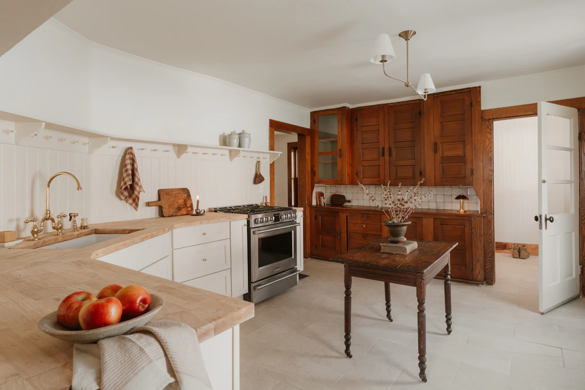
Not every rental kitchen benefits from brighter white. If the cabinets are almond, cream, warm maple, or beige, a soft limestone, ivory, or warm greige backsplash may look much more intentional. The slight warmth connects older finishes instead of making them look dated by comparison.
This is a strong option when you plan to keep the countertop accessories minimal and let texture do the work. If clutter is the real problem, solve that before adding pattern; our small kitchen organization guide can help you clear the counter so the backsplash becomes a focal point rather than another layer of visual noise.
9. Patterned Tile as a Controlled Accent
Patterned peel-and-stick tile can look stylish when it has a reason to stop. Instead of covering every backsplash wall, use it behind a coffee station, on the short wall behind the sink, or within one visually contained run of cabinets. A deliberate boundary makes the pattern feel designed rather than simply applied everywhere.
For a small rental, two or three colors are usually enough. Black and cream, dusty blue and white, or terracotta with warm beige can add character while still working with common cabinet finishes. Avoid tiny, high-contrast repeats if the kitchen has busy granite or several visible appliances.
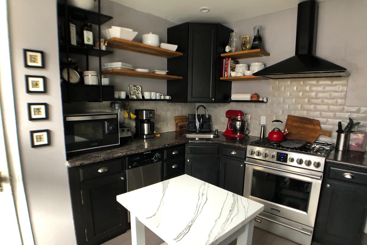
10. High-Contrast Tile That Makes Old Cabinets Feel Intentional
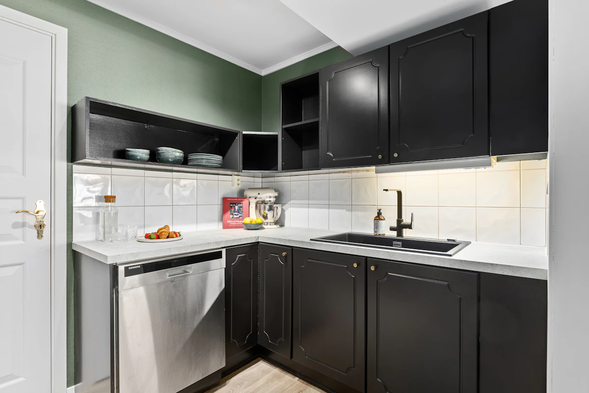
A dark charcoal backsplash behind white cabinets, or a bright backsplash behind black or deep wood cabinetry, can make an older kitchen feel intentional instead of mismatched. The key is repetition: echo the backsplash color in hardware, a small appliance, a runner, or framed art so it feels connected to the room.
Dark peel-and-stick material will show poor cuts and uneven seams more easily under under-cabinet lighting, so precision matters. If the wall is irregular, a mid-tone pattern with some texture is more forgiving than a perfectly flat black surface.
How to Make a Removable Backsplash Look Built-In
The most convincing renter-friendly backsplash usually gets three details right: scale, edges, and lighting. First, pick tile proportions that relate to the cabinet size. A tiny mosaic can look visually busy beneath wide modern doors, while oversized faux slabs may look awkward in a narrow galley. Second, plan where every exposed edge ends before you peel the backing. A clean stop at a cabinet edge, wall corner, or countertop return looks intentional.
Third, look at the backsplash under the lighting you actually use. Glossy material can exaggerate ripples and seams under strong under-cabinet LEDs, while a satin finish is more forgiving. Before ordering several boxes, tape up a sample for a few days and view it in morning light, evening light, and with the range hood or under-cabinet lights on.
Keep the styling around it restrained. Coordinating cabinet hardware, a wood cutting board, and one or two ceramics usually does more for a polished look than adding more decorative objects. If you want additional reversible ideas beyond the kitchen, our guide to renter-friendly wall decor without drilling follows the same low-commitment approach.
Measure Before You Order
Measure each backsplash section separately in inches, multiply width by height, then divide by 144 to get square feet. A 10-foot run that is 18 inches high is about 15 square feet. Add a sensible cutting allowance—often around 10 percent for a simple layout and more when a pattern needs matching or the wall has many outlets and corners.
Do not assume every sheet in a package represents the same usable coverage after overlaps or trimming. Use the manufacturer’s stated coverage and order enough material from the same production batch where possible so color and sheen stay consistent.
Install for Easy Removal, Not Just Easy Application
Degrease and dry the wall, remove dust around outlets, and test a small hidden area first. Do not install over loose paint, crumbling drywall, or a textured surface just because the adhesive feels strong enough to stick. Strong adhesion to a weak painted surface can simply pull that weak layer away later.
Heat and moisture limits vary by brand and product. Smart Tiles, for example, says its backsplash tiles can go on smooth surfaces and existing tile, but its product guidance includes specific heat and water-contact limits. Check the exact model you buy rather than assuming all peel-and-stick tile is suitable directly behind every range or beside every sink. See the current Smart Tiles product guidance for an example of the technical limits manufacturers publish.
When removal day comes, follow the manufacturer’s method and work slowly. Do not promise yourself that “renter friendly” means “zero chance of paint damage.” The wall condition, paint quality, curing time, adhesive strength, and how long the product has been installed can all affect the result.
Frequently Asked Questions
Can peel-and-stick backsplash damage rental walls?
It can. Removal risk depends on the adhesive, paint condition, surface preparation, curing time, and how long the material stays installed. Test a hidden area first and follow the product’s removal instructions.
Can renter-friendly backsplash go over existing tile?
Some products are designed for smooth existing tile, but deep grout lines and textured tile can show through. Check the manufacturer’s approved surfaces and test whether the old grout pattern telegraphs through the new material.
Can I use peel-and-stick backsplash behind a stove?
Only when the specific product is rated for that location and its required clearances and temperature limits are met. Heat resistance varies, so use the manufacturer’s technical guidance rather than a general peel-and-stick rule.
What backsplash makes a rental kitchen look more expensive?
Simple patterns usually look most convincing: elongated subway tile, quiet zellige-look color, restrained marble, or a warm stone tone that relates to the cabinets and counter. Clean edges and careful alignment matter as much as the pattern.
How much backsplash should I order?
Calculate the square footage of each wall section and use the manufacturer’s coverage per package. Add extra material for trimming, pattern matching, outlets, and mistakes; simple layouts generally need less overage than complex repeats.
What if my rental wall is textured?
Many peel-and-stick backsplash products are intended for smooth, firm surfaces and may not adhere reliably to texture. Do not try to compensate with stronger glue in a rental; choose another reversible approach or ask the landlord about an approved substrate.
Choose the Backsplash That Fits the Rental, Not Just the Trend
The strongest renter friendly kitchen backsplash ideas do not call attention to the fact that they are removable. They respect the existing cabinet color, countertop undertone, lighting, wall condition, and the way the kitchen is actually used. A simple white tile can be the right answer in one apartment, while muted green, warm stone, or a controlled pattern can completely change another.
Start with a sample, inspect it under your real lighting, verify the manufacturer’s surface and heat requirements, and plan the edges before installation. If the backsplash looks calm, aligned, and connected to the rest of the room, it will feel like a design decision rather than a temporary cover-up.

Share Your Thoughts