
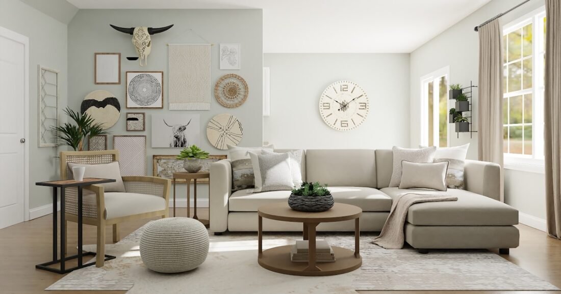
Warm neutrals and cool neutrals can look almost identical on a paint chip, then behave completely differently once they are surrounded by flooring, wood, stone, metal, daylight, and artificial light. That is why a beige that felt calm in the store can turn unexpectedly yellow at home, while a pale gray can suddenly read blue or lavender.
The useful question is not whether warm neutrals are better than cool neutrals. It is which undertone belongs with the fixed elements and light already in your room. Once you understand that relationship, choosing paint, upholstery, rugs, curtains, and finishes becomes much easier—and you can still mix warm and cool notes without making the space feel mismatched.
Table of Contents
What Warm and Cool Neutrals Actually Mean
A neutral is rarely colorless. Beige, white, gray, taupe, cream, and greige usually carry an undertone that pushes them warmer or cooler. Warm neutrals tend to lean yellow, red, orange, or brown. Cool neutrals tend to lean blue, green, violet, or a crisper gray.
Sherwin-Williams describes undertone as the underlying hue that distinguishes one apparently similar color from another, and recommends comparing colors side by side rather than judging a pale neutral in isolation. Its guide to paint undertones is useful if you are trying to train your eye.
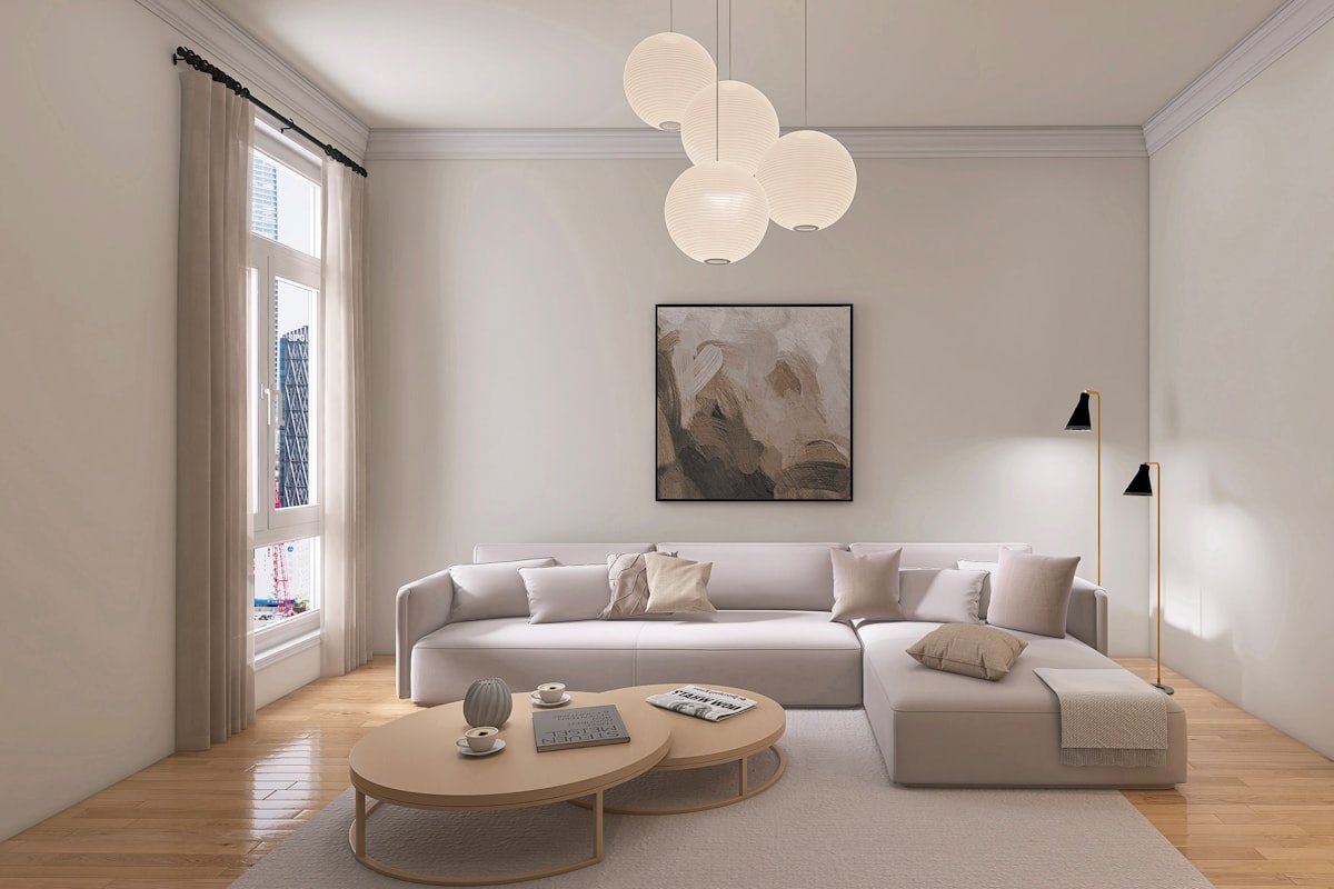
The difference is easiest to see when two neutrals meet. Put a creamy white next to a blue-gray and the cream suddenly looks warmer. Put the same cream beside honey oak and it may look quiet and balanced. Context is doing the work.
Start With the Finishes You Cannot Easily Change
Before choosing a wall color, look at the expensive or permanent elements in the room: flooring, countertops, backsplash tile, fireplace stone, large wood furniture, cabinetry, and broad expanses of carpet. These should influence your neutral direction more than a pillow or small vase that can be replaced in five minutes.
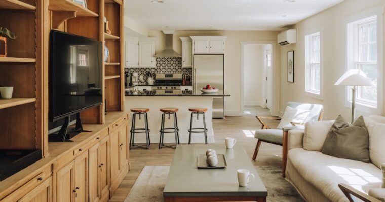
For example, a room with medium oak floors, a camel leather sofa, and cream stone already has a warm foundation. A neutral with a subtle beige, mushroom, or warm greige undertone is likely to connect those materials more naturally than a sharp blue-gray. By contrast, a kitchen with blue-gray cabinets, white quartz, brushed nickel, and cool marble may be happier with a cleaner white or restrained cool greige.
This is also the foundation of a good whole-home color palette: start with what stays, then build the flexible colors around it instead of choosing each room independently.
How Light Changes a Neutral
Light can reveal an undertone that seemed almost invisible on the sample. A north-facing room often receives cooler, bluer natural light, while southern exposure generally feels warmer and more generous. Artificial lighting adds another layer: a warm 2700K lamp can make cream and wood look richer, while a cooler bulb may sharpen gray and blue notes.
Sherwin-Williams’ room-orientation guidance explains how daylight direction affects paint perception. Treat that as a starting point rather than a formula because nearby trees, porches, neighboring buildings, window size, and flooring all change the result.
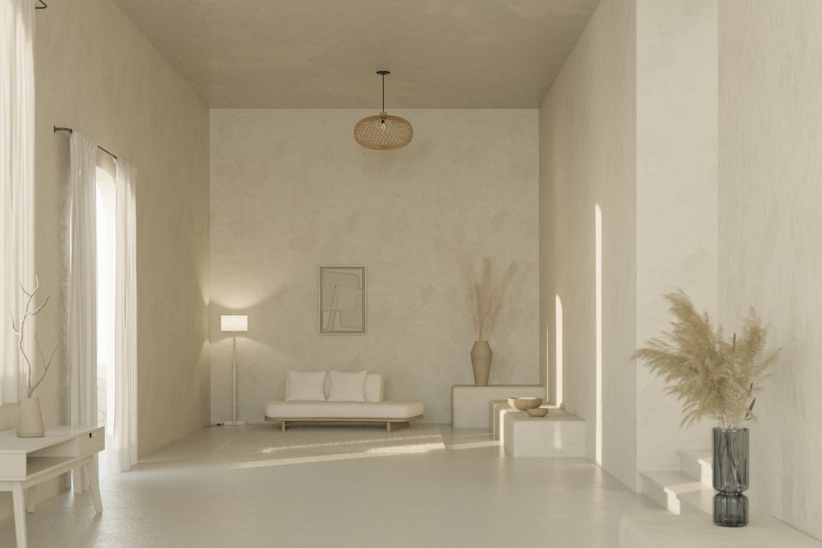
Do not approve a neutral from a tiny chip. Paint a large sample board or use a large removable sample and move it around the room. Check it beside the floor, sofa, trim, and window in the morning, afternoon, and evening. If it only looks good for one hour of the day, keep testing.
When Warm Neutrals Work Best
Warm neutrals are especially useful when the room contains natural wood, aged brass, terracotta, cream stone, woven fibers, brown leather, rust, olive, or other earthy materials. They can soften a room that receives cool daylight and make older warm-toned finishes feel intentional rather than dated.
Think in families rather than labels. “Beige” can range from pink-beige to golden beige to a muted green-beige. “Warm white” can be creamy, peachy, or softly greige. The goal is not simply to choose a warm color; it is to choose a warmth that agrees with the room.
A useful living-room combination might be warm off-white walls, oatmeal upholstery, medium walnut, a muted olive chair, and a small amount of aged brass. In a bedroom, ivory walls, flax bedding, natural oak, and muted rust can feel calm without becoming overly beige. Our guide to making a bedroom look polished on a budget shows how repeated warm materials can create a more considered result.
When Cool Neutrals Work Best
Cool neutrals make sense when the architecture and finishes already lean crisp: blue-gray cabinetry, charcoal upholstery, cool white stone, chrome, polished nickel, blackened metal, pale gray tile, or cooler woods. They can also calm a strongly warm room when used deliberately, especially as a controlled counterpoint rather than a blanket of gray.
A cool neutral does not have to feel cold. Texture and lighting matter. A soft gray sofa beside a wool rug, linen curtains, matte ceramics, and warm lamps can feel welcoming even when the palette is technically cool. Problems usually appear when cool walls are combined with cold lighting, glossy surfaces, and no natural texture.
How to Mix Warm and Cool Neutrals Without Creating a Clash
You do not have to choose one temperature for every object. The most convincing rooms often mix both. The trick is to make one family dominant and use the other as contrast.
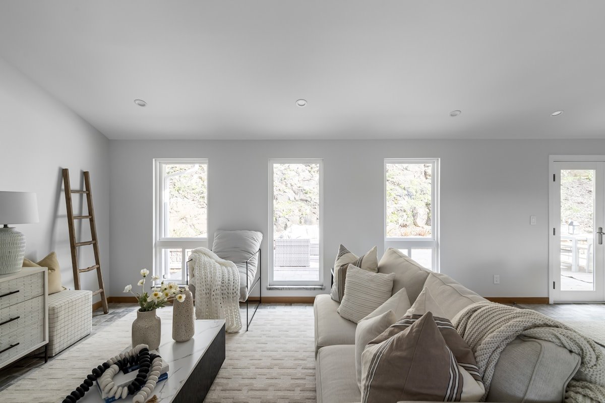
- Warm base, cool contrast: creamy walls, oak furniture, and a blue-gray rug or slate-colored chair.
- Cool base, warm contrast: pale gray walls, white upholstery, natural walnut, camel leather, or a muted rust throw.
- Bridge with greige: a balanced greige can connect warm wood with cooler stone when neither extreme feels right.
- Repeat each temperature: if you introduce black, blue-gray, brass, or camel, repeat it at least once so it does not look accidental.
Mixed metals follow the same principle. Brushed nickel and brass can coexist when one is dominant and both appear more than once. Randomly adding a single warm metal to an otherwise cool room often looks less intentional than repeating that finish in a lamp, frame, or hardware detail.
A Room-by-Room Neutral Strategy
Different rooms can lean warmer or cooler while the home still feels connected. Use one recurring neutral, trim color, wood tone, or accent family to create continuity.
| Room | Useful starting point | What to check |
|---|---|---|
| Living room | Undertone of flooring and largest upholstery | Daylight direction, rug, fireplace, adjacent rooms |
| Bedroom | Bedding, headboard, flooring | Evening lamp color, curtains, wood furniture |
| Kitchen | Cabinetry, counters, backsplash | Under-cabinet light, appliance finishes, open sightlines |
| Bathroom | Tile, vanity, countertop | Artificial light, mirror reflection, moisture-resistant finishes |
| Hallway | Colors visible from connected rooms | Limited daylight and transitions at doorways |
If your rooms are small or visually connected, continuity becomes even more important. The same idea helps when decorating a small living room: fewer abrupt visual changes can make the space easier for the eye to read.
Common Neutral-Color Mistakes
The biggest mistake is choosing a neutral because it looks attractive online. Photography, editing, screen settings, and a completely different set of finishes can make the same paint behave very differently in your home.
- Testing only one wall: a color can change noticeably from the window wall to the darkest corner.
- Ignoring the floor: flooring covers a huge visual area and often determines whether a neutral looks harmonious.
- Mixing several competing beiges: pink-beige, yellow-beige, and green-beige can fight even though all three are “warm.”
- Using cool bulbs with a warm palette: the room may look flatter or dirtier than expected.
- Trying to match every neutral exactly: a room needs variation in value and texture or it can look flat.
- Changing every room independently: visible sightlines can make individually attractive colors feel disconnected.
If you enjoy trend references, use them as a filter rather than a rule. Our 2026 home decor trends guide can provide direction, but permanent finishes and your actual light should make the final decision.
Frequently Asked Questions
How can I tell if a neutral paint color is warm or cool?
Compare it beside a true white and beside other neutrals. Warm neutrals usually reveal yellow, red, orange, or brown undertones; cool neutrals tend to reveal blue, green, violet, or crisper gray undertones.
Can warm and cool neutrals be used in the same room?
Yes. Choose one temperature as the dominant family and repeat the contrasting temperature in a few deliberate accents, such as warm wood in a cool room or blue-gray textiles in a warm room.
Is greige warm or cool?
Greige can lean either way. Some greiges have warm beige or taupe undertones, while others lean cooler and grayer. Always compare a sample with your flooring, furniture, and light.
Do north-facing rooms need warm neutrals?
Not always, but cooler northern light can emphasize blue undertones. A warmer neutral often balances that effect, though the best choice still depends on your windows, flooring, furnishings, and desired mood.
Why does my beige paint look pink or yellow at home?
The undertone is being emphasized by nearby colors or lighting. Compare the paint with flooring, trim, countertops, and fabrics, then view it under the bulbs and daylight conditions you actually use.
Should every room in a house use the same neutral?
No. Connected rooms can use different neutrals as long as they share a compatible undertone, trim color, material, or recurring accent that creates visual continuity.
Choose the Undertone Before the Exact Shade
Warm neutrals vs. cool neutrals is ultimately a compatibility question. Start with the surfaces you cannot easily change, identify their dominant undertones, then test a small group of related neutrals in the room’s real daylight and artificial light. Once the undertone is right, choosing the exact depth—from soft off-white to deeper taupe or gray—becomes a much more manageable decision.
If you are coordinating more than one room, build the broader palette before buying gallons of paint. A connected plan will save more time and money than trying to correct a beautiful color that simply belongs to a different house.


Share Your Thoughts